
CSS-Eigenschaft: animation, Kategorien: Animierte Inhalte (allgemein), Animations (CSS 3)
Animation, Veränderungen von CSS-Eigenschaften in definierter Zeit.
Kurzschreibweise für Animationen. Über "animation" können CSS-Eigenschaften in einer festgelegten Zeit Ihren Zustand verändert werden.
| Kurzbeschreibung | Werte | Standardwert | Kategorie | Hinweis |
|---|---|---|---|---|
| Animation, Veränderungen von CSS-Eigenschaften in definierter Zeit. | see individual properties |
| Neu in CSS 3 |
Verwandte Eigenschaften aus der Kategorie: Animierte Inhalte (allgemein), Animations (CSS 3):
- Aktuelle Seite: animation
- animation-delay
- animation-direction
- animation-duration
- animation-fill-mode
- animation-iteration-count
- animation-name
- animation-play-state
- animation-timing-function
- marquee-direction
- marquee-play-count
- marquee-speed
- marquee-style
- transition
- transition-delay
- transition-duration
- transition-property
- transition-timing-function
 Firefox |  Chrome |  Internet Explorer |  Safari |  Opera |
|||||||||||||||||||||||||||||||||
|---|---|---|---|---|---|---|---|---|---|---|---|---|---|---|---|---|---|---|---|---|---|---|---|---|---|---|---|---|---|---|---|---|---|---|---|---|---|
| CSS3 |
|
|
|
|
| ||||||||||||||||||||||||||||||||
Weiterführende Informationen zu animation:
- W3C Spezifikation:
http://www.w3.org/TR/css3-animations/#animation
- letzte CSS-Eigenschaft (Acc-Key: ALT + SHIFT + z):
alignment-baseline - nächste CSS-Eigenschaft (Acc-Key: ALT + SHIFT + w):
animation-delay
Beispiele
HTML:
<div id="stage">
<div id="slide">
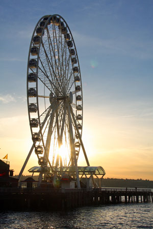
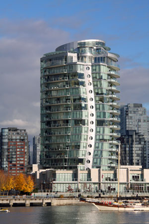
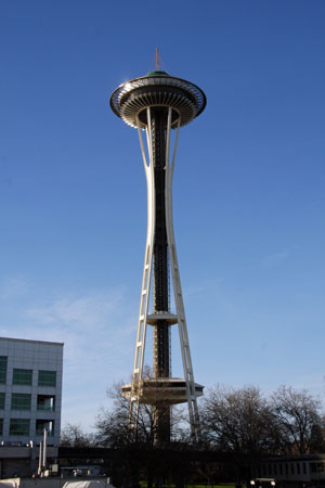
<img src="img/seattle-great-wheel.jpg" alt="Great Wheel - Seattle "><img src="img/vancouver-granville-island.jpg" alt="Granville Island - Vancouver"><img src="img/space-needle-seattle.jpg" alt="Space Needle - Seattle"><img src="img/seattle-great-wheel.jpg" alt="">
</div>
</div>CSS:
#stage {
    width: 300px;
    height: 450px;
    border: 4px solid black;
    overflow: hidden;
}
#slide {
    width: 1200px;

    -webkit-animation-duration: 30s;
    animation-duration: 30s;

    -webkit-animation-name: slideshow;
    animation-name: slideshow;

    -webkit-animation-iteration-count: 5;
    animation-iteration-count: 5;

    -webkit-animation-timing-function: linear;
    animation-timing-function: linear;

    -webkit-animation-delay: 1s;
    animation-delay: 1s;
}
#slide img {
    border-left: 1px solid black;
    margin-left: -1px;
}
@-webkit-keyframes slideshow {
    from {
        margin-left: 0px;
    }
    to {
        margin-left: -900px;
    }
}
@keyframes slideshow {
    from {
        margin-left: 0px;
    }
    to {
        margin-left: -900px;
    }
}
Beispiel nur für: 


Beispiel Nr. 1 So sieht's aus:
HTML:
<div id="cube">
    <img src="img/ball-blau.png" alt="Blaue Kugel">
</div>
CSS:
#cube {
    width: 300px;
    height: 300px;
    border: 4px solid black;
}
#cube img {
    position: relative;
    -webkit-animation-duration: 5s;
    animation-duration: 5s;

    -webkit-animation-name: rollingball;
    animation-name: rollingball;

    -webkit-animation-iteration-count: infinite;
    animation-iteration-count: infinite;

    -webkit-animation-timing-function: ease-in;
    animation-timing-function: ease-in;
}
@-webkit-keyframes rollingball {
    from {
        left: 0px;
        top: 0px;
    }
    25% {
        left: 200px;
        top: 0px;
    }
    50% {
        left: 200px;
        top: 200px;
    }
    75% {
        left: 0px;
        top: 200px;
    }
    to {
        left: 0px;
        top: 0px;
    }
}
@keyframes rollingball {
    from {
        left: 0px;
        top: 0px;
    }
    25% {
        left: 200px;
        top: 0px;
    }
    50% {
        left: 200px;
        top: 200px;
    }
    75% {
        left: 0px;
        top: 200px;
    }
    to {
        left: 0px;
        top: 0px;
    }
}
Beispiel nur für:
Beispiel Nr. 2 So sieht's aus:

Fehler melden
Diese Referenz ist ein Freizeitprojekt ohne aufwendiges Lektorat oder Vergleichbarem. Von daher lassen sich bei dem Umfang dieser Referenz trotzt größtmöglicher Sorgfalt Fehler nicht vermeiden.
Hilf, die Qualität dieser Seite zu verbessern! Sollte Dir ein Fehler auffallen, sei es in den Erklärungen, Beispielen oder den Informationen zum Browsersupport, seien es orthographische oder grammatikalische, sende eine kurze E-Mail an info@css-wiki.com. Auch Anregungen und Verbesserungsvorschläge sind jeder Zeit Willkommen. Jede E-Mail wird persönlich beantwortet!
Vielen Dank!